
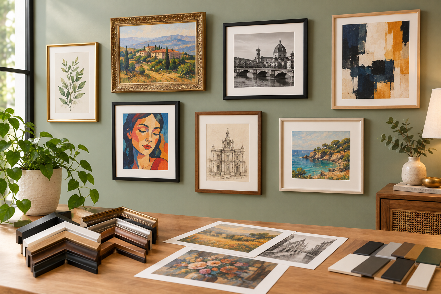
The best frame colour and style depends on the artwork and the room: black suits high-contrast and modern pieces, natural wood suits warm and traditional interiors, white or off-white works almost universally for a clean gallery look, gold and brass suit classical or richly coloured art, and metal suits contemporary pieces. For style, minimalist thin frames suit modern art, classic moulding suits traditional pieces, and floating frames suit canvas and textured work. Online art framing in Dubai typically lets you preview these combinations against your actual piece before ordering custom art framing.
Walk past a gallery wall that genuinely works and you'll notice the frames before you notice why they work. The colour feels inevitable, like there was never another option — even though there were dozens. That's not luck. It's a handful of colour and style principles applied consistently.
Rather than starting from your artwork and working outward (a useful exercise, but a slower one), this guide starts from the frame itself — colour first, then style — so you can go the other direction: pick the tone that fits your space, then match your art framing to it. Whether you're framing a single statement piece or planning an entire collection of custom art framing, the same handful of principles apply at any scale.
The Frame Colour Guide
Six tones cover almost every art framing decision. Here's what each one actually does to a piece of art hanging on your wall.
|
|
Black |
Mood: Bold, modern, high contrast — the colour equivalent of a clean full stop.
Best for: Black-and-white photography, graphic and abstract art, high-contrast pieces, and modern or minimalist interiors.
Watch out for: Can feel heavy on soft, pastel, or delicate watercolour pieces — pair carefully or choose a thinner profile.
|
|
White / Off-White |
Mood: Clean, neutral, gallery-like — recedes rather than competing with the art.
Best for: Colourful or busy artwork, contemporary prints, and almost any gallery wall where you want the art itself to lead.
Watch out for: Can look stark or clinical in very warm, traditional interiors without a mat or accent to soften it.
|
|
Natural Wood |
Mood: Warm, organic, grounding — brings texture into an otherwise flat wall.
Best for: Landscape photography, warm-toned portraits, traditional and Scandinavian interiors, and long-term family pieces.
Watch out for: Undertone matters — match warm wood to warm-toned art and cooler wood to cooler-toned pieces, or the pairing can clash subtly.
|
|
Gold / Brass |
Mood: Classical, rich, a touch formal — reads as considered rather than flashy when used well.
Best for: Classical and traditional artwork, richly coloured oil paintings, and formal living or dining spaces.
Watch out for: Easy to overdo — reserve for one or two statement pieces rather than an entire gallery wall.
|
|
Silver / Metal |
Mood: Cool, contemporary, understated — a quieter alternative to black for modern spaces.
Best for: Digital art, architectural photography, black-and-white pieces, and minimalist or industrial interiors.
Watch out for: Can feel cold paired with warm-toned artwork; works best with cooler colour palettes.
The Frame Style Guide
Colour sets the tone; style sets the personality. A few core styles worth knowing:
• Minimalist / thin profile — a slim, understated moulding that keeps focus entirely on the art; suits modern, contemporary, and digital pieces
• Classic moulding — moderate width with subtle detailing at the corners; suits traditional paintings and formal spaces
• Ornate / carved — decorative detailing and a heavier presence; suits classical or statement pieces, best used sparingly
• Floating frame — the canvas appears to float within the frame with a visible gap around the edges; suits canvas art and textured pieces
• Shadow box — a deeper profile that allows for dimensional or layered pieces, not just flat artwork
Combining Colour and Style: A Quick Reference
|
Pairing |
Best Suited To |
|
Black + minimalist |
Modern photography, graphic prints |
|
Natural wood + classic moulding |
Traditional portraits, landscape art |
|
White + floating frame |
Canvas art, contemporary abstract pieces |
|
Gold + ornate |
Classical paintings, formal statement pieces |
|
Metal + minimalist |
Architectural and black-and-white photography |
Colour Mistakes Specific to Art Framing
• Matching the frame to the wall colour instead of the artwork — the art should lead the decision, not the paint
• Using warm and cool metal tones (gold and silver) in the same cluster without a unifying third element
• Choosing a trend colour for a piece you intend to keep displayed for many years
• Ignoring the room's existing furniture tones, which the frame will sit alongside daily, not just the wall behind it
Colour and Style Trends Worth Knowing
• Warm, mixed-wood tones replacing uniform black across gallery walls
• Floating frames for canvas art becoming the default over traditional glazed framing
• Thin brass accents paired with black frames for a subtle, layered look
• Larger single statement pieces in bold frame colours, replacing clusters of smaller uniform frames
Trends are worth knowing, but they're the one part of this guide worth holding loosely. A frame colour chosen purely because it's current tends to look dated faster than one chosen because it genuinely suits the artwork — which is really the whole argument for starting with mood and undertone rather than whatever's trending this season.
A Note on Mixed-Media and Multi-Piece Collections
Framing a single piece is one decision. Framing a growing collection — several pieces acquired over time, in different styles — is really several decisions that need to agree with each other. The most reliable approach is picking one dominant frame colour as your collection's throughline (black, or natural wood, most commonly) and allowing style to vary more freely within that constraint. A minimalist black frame and a slightly more classic black frame can sit on the same wall comfortably; a black frame and a gold frame need far more careful placement to avoid feeling accidental.
Previewing Colour and Style Before You Commit
Frame colour is genuinely difficult to judge from a small sample swatch — a corner of moulding the size of a fingernail rarely predicts how a full frame will read around your actual artwork. Online art framing in Dubai typically solves this by letting you preview frame and mat combinations directly against your uploaded piece, so the decision is based on the real pairing rather than an imagined one.
1. Upload your artwork or enter its dimensions for custom art framing
2. Browse frame colours and preview each against your actual piece
3. Select a style — minimalist, classic, ornate, floating, or shadow box — to match the artwork's character
4. Add matting or glazing as needed
5. Confirm your price and order online custom framing in Dubai for delivery
Frequently Asked Questions
What frame colour goes with most types of art?
White or off-white frames work almost universally, since they recede rather than compete with the artwork's own colours. Black is the next most versatile choice, especially for high-contrast or modern pieces.
Should I match my frame to my wall colour or my artwork?
The artwork should lead. Matching a frame to the wall behind it often looks accidental rather than intentional, while matching (or thoughtfully contrasting) the frame to the art itself reads as a considered design choice.
What frame style suits a canvas painting best?
Floating frames are especially popular for canvas art, since they leave a visible gap around the edges that lets the canvas read as intentionally showcased rather than boxed in.
Is gold framing too old-fashioned for modern art?
Not necessarily — a thin, understated gold or brass accent can work well with modern pieces when used sparingly. It's ornate, heavily detailed gold moulding that tends to clash with contemporary artwork.
Can I preview different frame colours on my artwork before ordering online?
Yes. Most online art framing services in Dubai let you preview frame and mat colour combinations against your actual uploaded artwork before confirming your custom art framing order.
Frame colour and style aren't separate decisions from the artwork itself — they're an extension of it. Start with the mood your piece already has, match a colour and style that reinforces rather than fights that mood, and the frame stops being an afterthought and starts doing real work on the wall.
That's the difference between a frame that simply holds a piece of art and one that genuinely elevates it — and it's a decision worth making deliberately, whether it's for a single treasured piece or an entire wall built up over years.